Tate Ridenour
web design
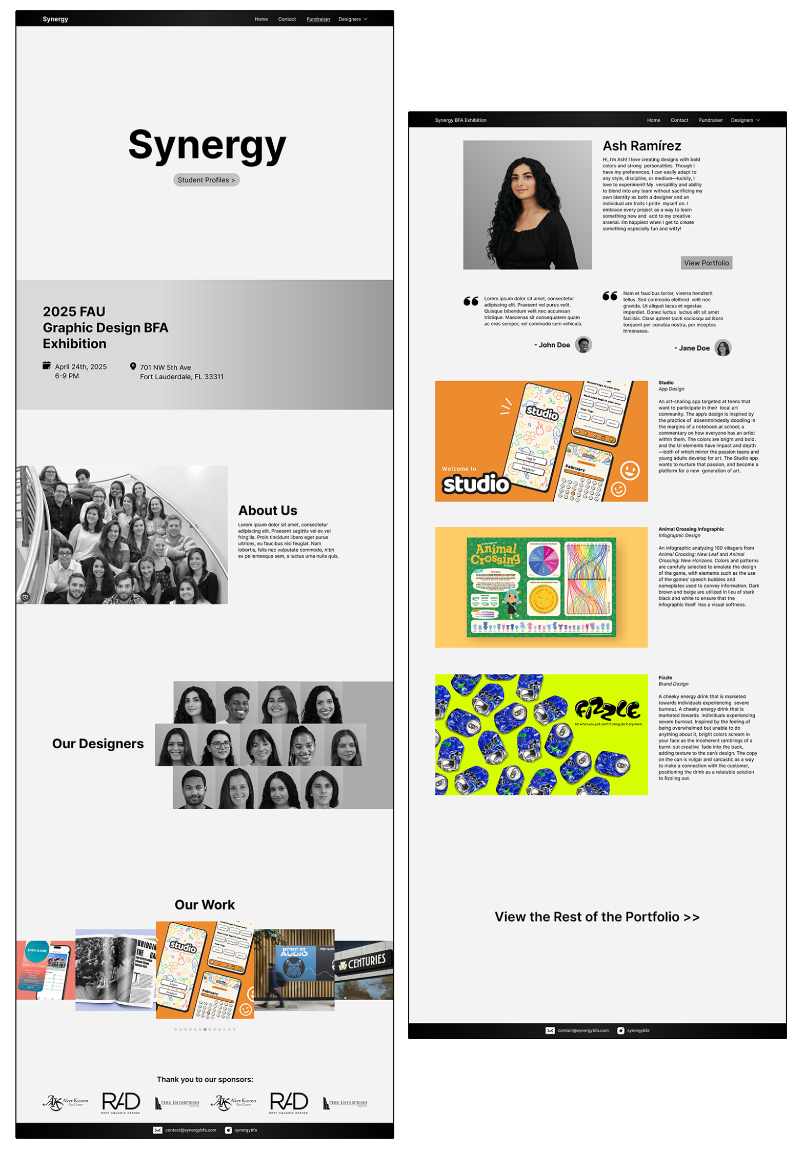
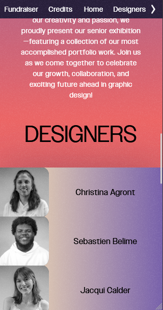
Synergy is a graphic design exhibition for a class
of newly graduating students. Various brand elements
had already been chosen, which specified the color
scheme, the logo, and the use of gradients. Given
these elements, I was tasked with integrating them
into an interactive website to showcase the
portfolios of the students and give information
about the event.
I knew that an exhibition in a creative field would
allow for creative risks, so the website includes
things such as a flashy opening animation, a visual
structure based on gradients, and an unconventional
layout. The student pages have a simpler design as
to not take attention away from the student work.
Designs were wireframed in Figma, then programmed
with raw HTML and CSS. Great care was put into
responsive design for mobile.
WIREFRAMES
DESKTOP
MOBILE
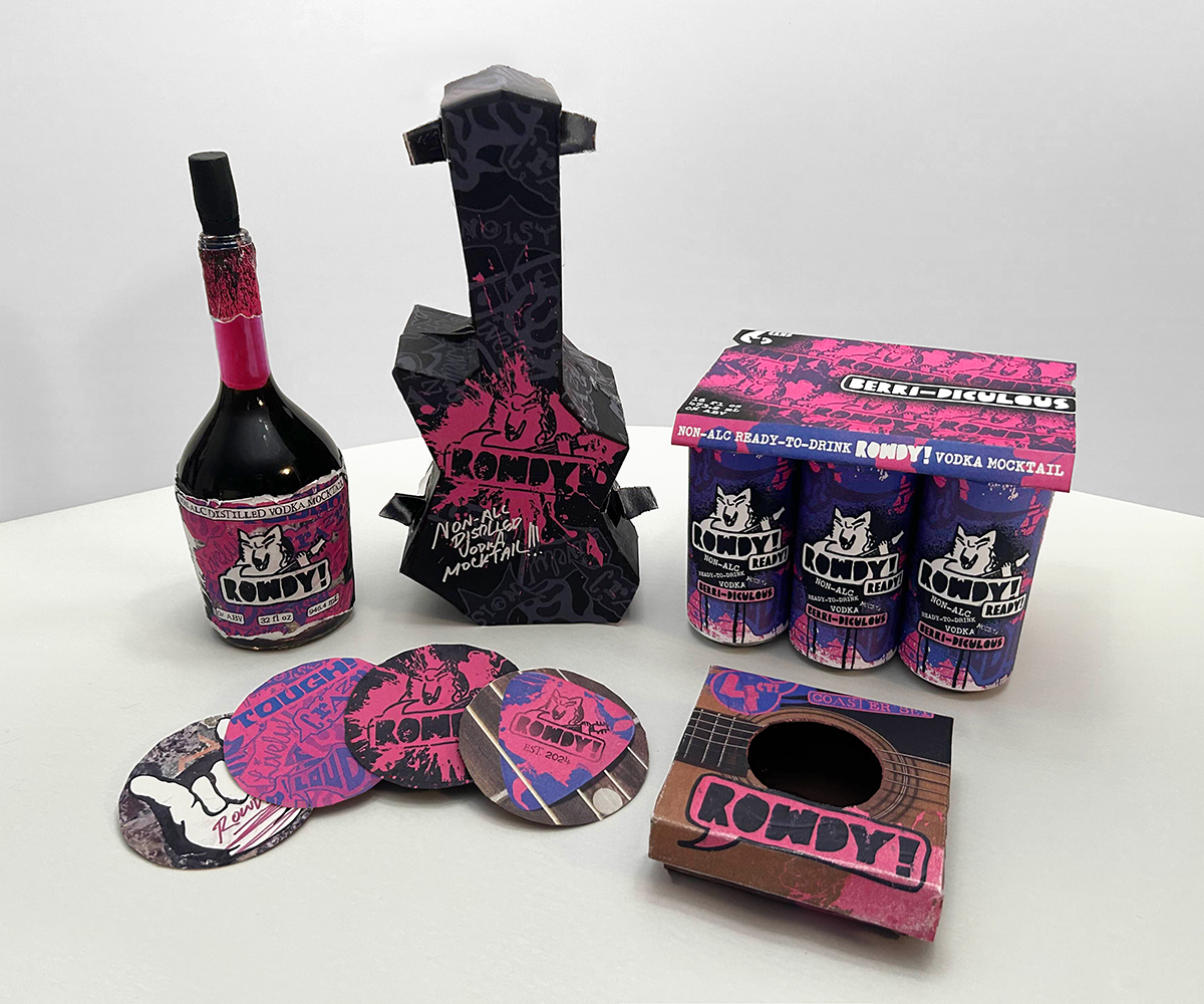
system design
A fictional brand of "mocktail" (non-alcoholic cocktail) that
uses grunge aesthetics to appeal to individuals who
want the same experience as alcohol: to get rowdy!
This approach starkly contrasts competing brands,
which have designs geared towards health,
relaxation, and mindfulness. All elements were
created from the ground up.
Below is
included a full process book detailing each step of
development.
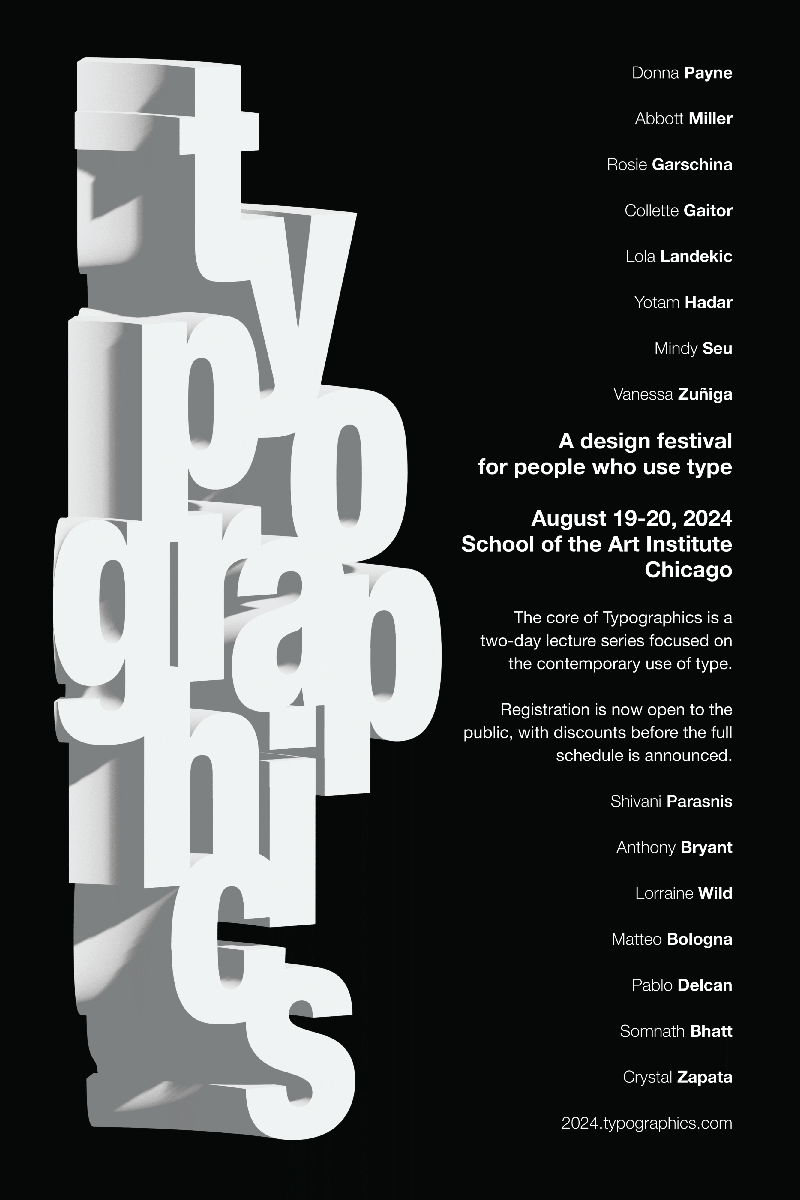
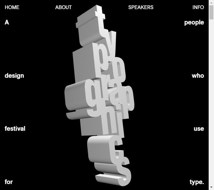
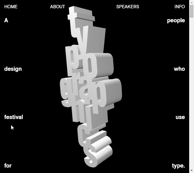
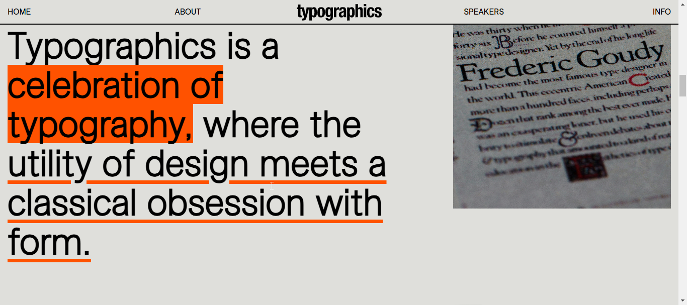
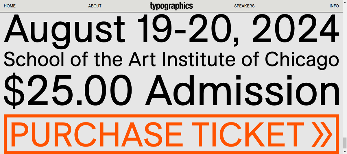
website
A website to advertise details, inform attendees, and facilitate ticket sales for a fictional design convention. Geared towards contemporary typography, the website emphasizes sleek, minimal, and unique design, likening modern letterforms to classical sculpture.
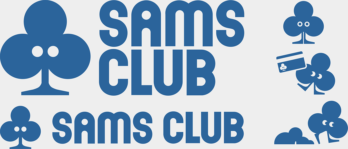
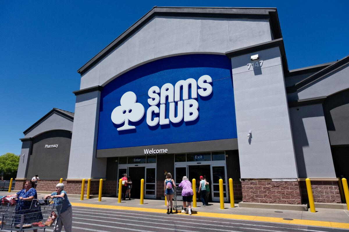
logo design (group project)
A modern theoretical rebrand of warehouse retail store Sam's Club to market more to Millennials and Generation Z. The logo was designed in a team of four, representing an ability to work within groups.
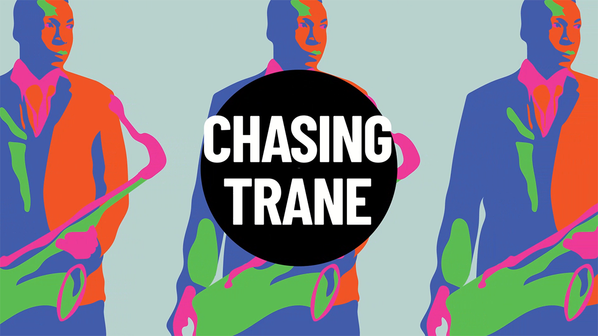
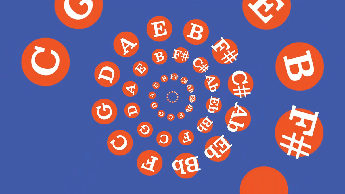
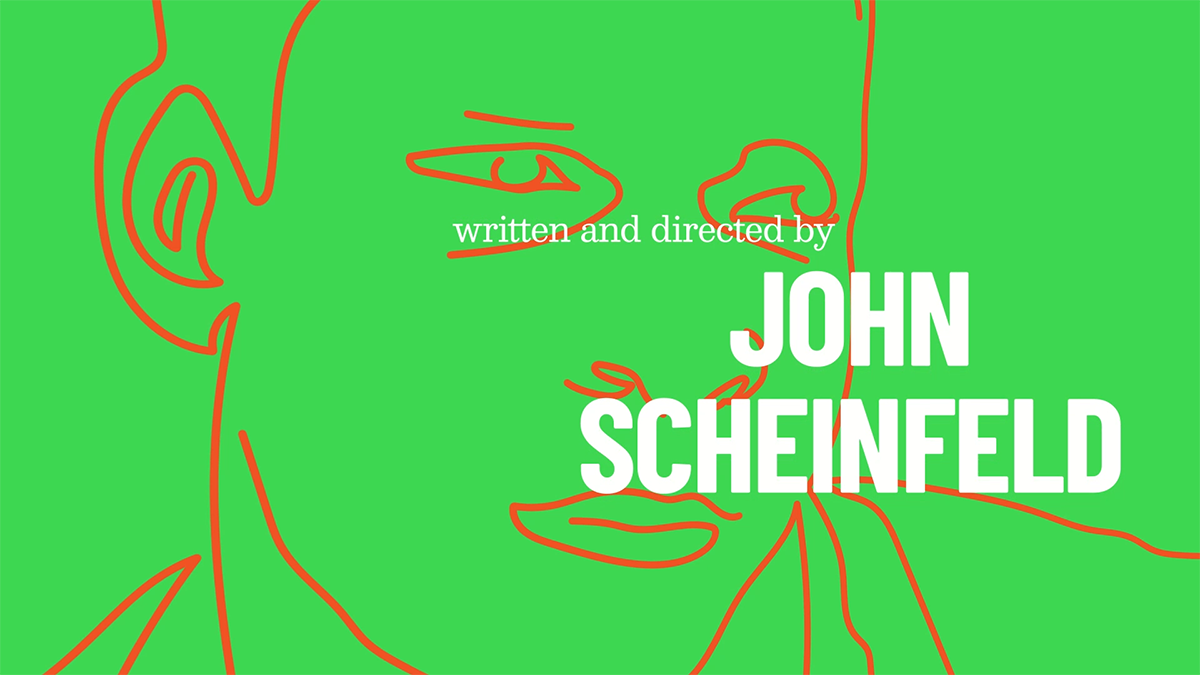
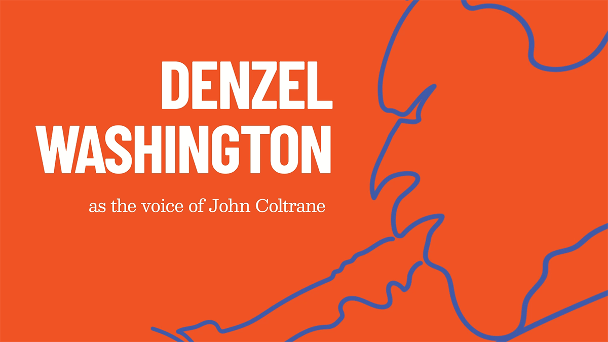
motion graphics
A theoretical title sequence that excites viewers for a deep dive into clips and writings from the great jazz musician John Coltrane. Visuals were inspired by posters from Swiss graphic designer Niklaus Troxler.

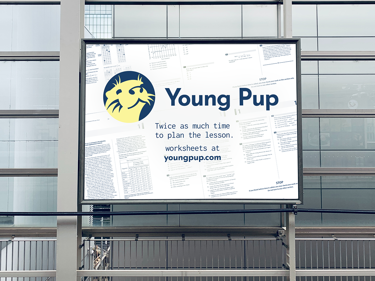
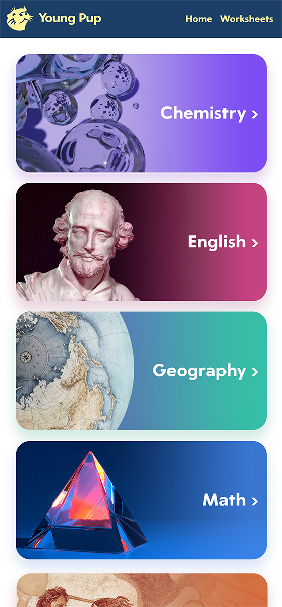
logo/app design
A fictional brand that provides free worksheets for teachers. The website is intended to be relaxing and calming as well as usable for those with bad eyesight.
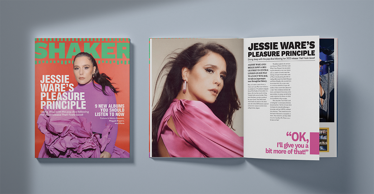
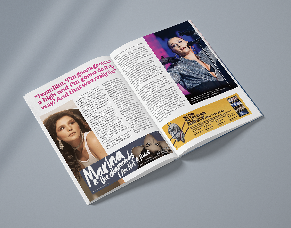
spread design
A fictional music publication focused on interviews with celebrities alongside general music coverage.

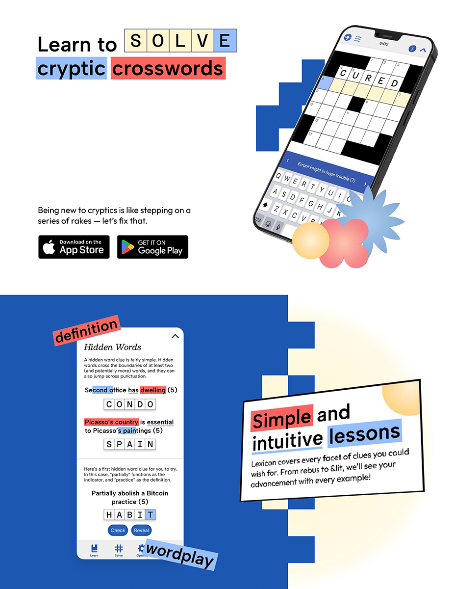
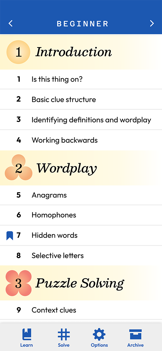
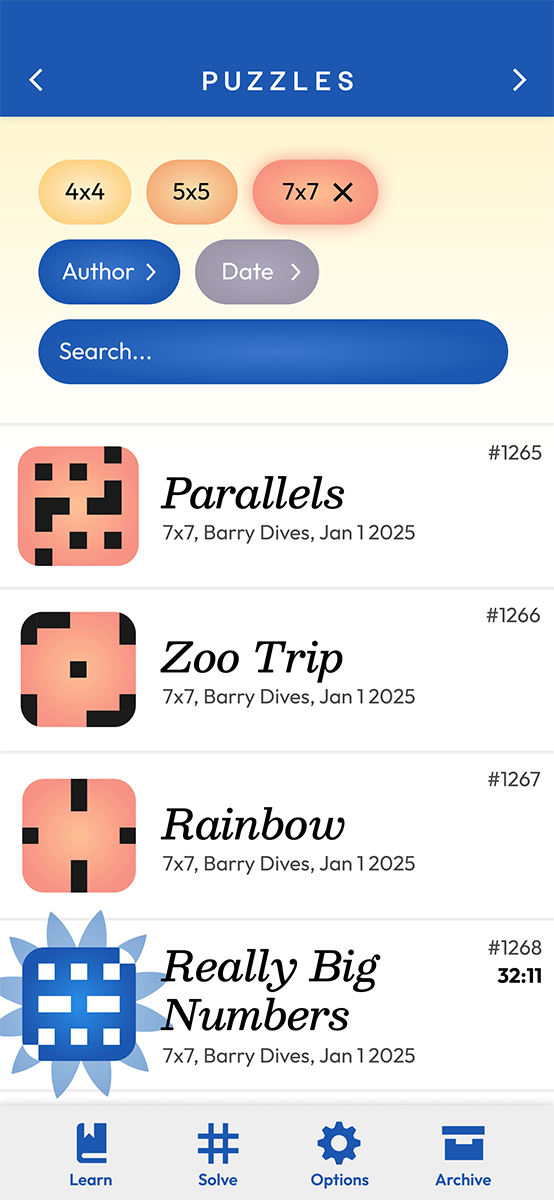
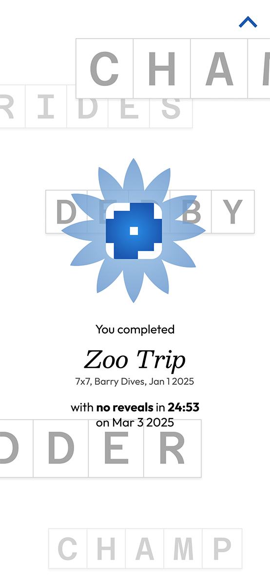
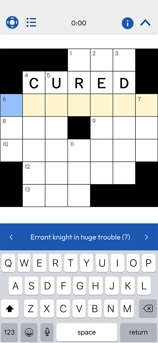
app design
A fictional app for teaching people how to play “cryptic crosswords”, a type of crossword focused on misleading wordplay that has a high barrier to entry. The app is meant to be inviting for all demographics as opposed to the traditional Gen X / Baby Boomer demographic that crosswords appeal to. The app uses the metaphor of a flower blooming to represent skill growth.
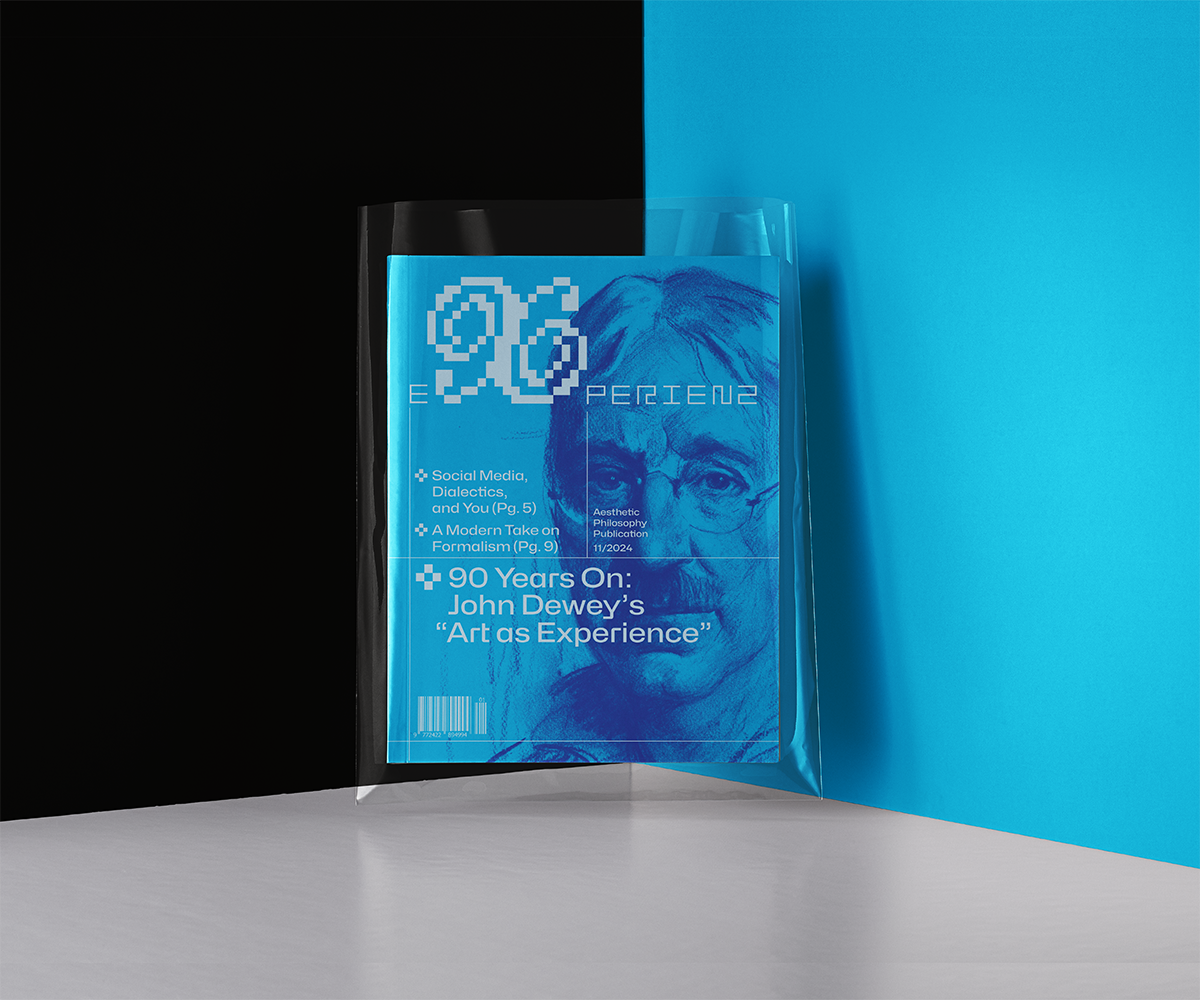
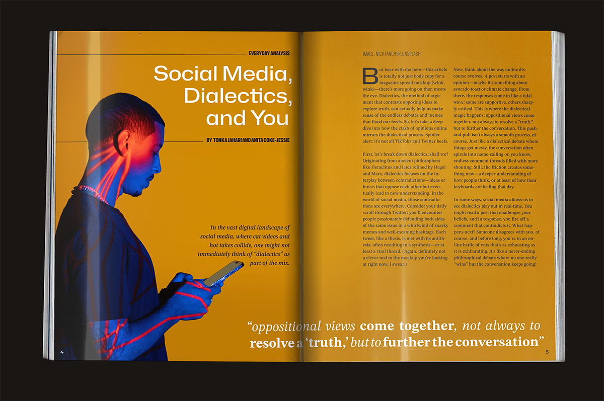
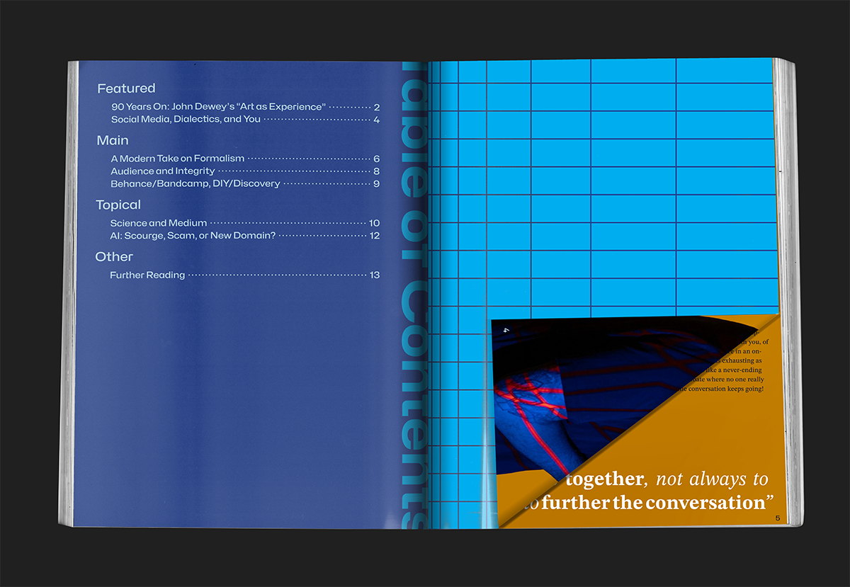
spread design
A fictional magazine about aesthetic philosophy. The spreads have unique compositions and use of space to appeal to a readerbase that's familiar with art.
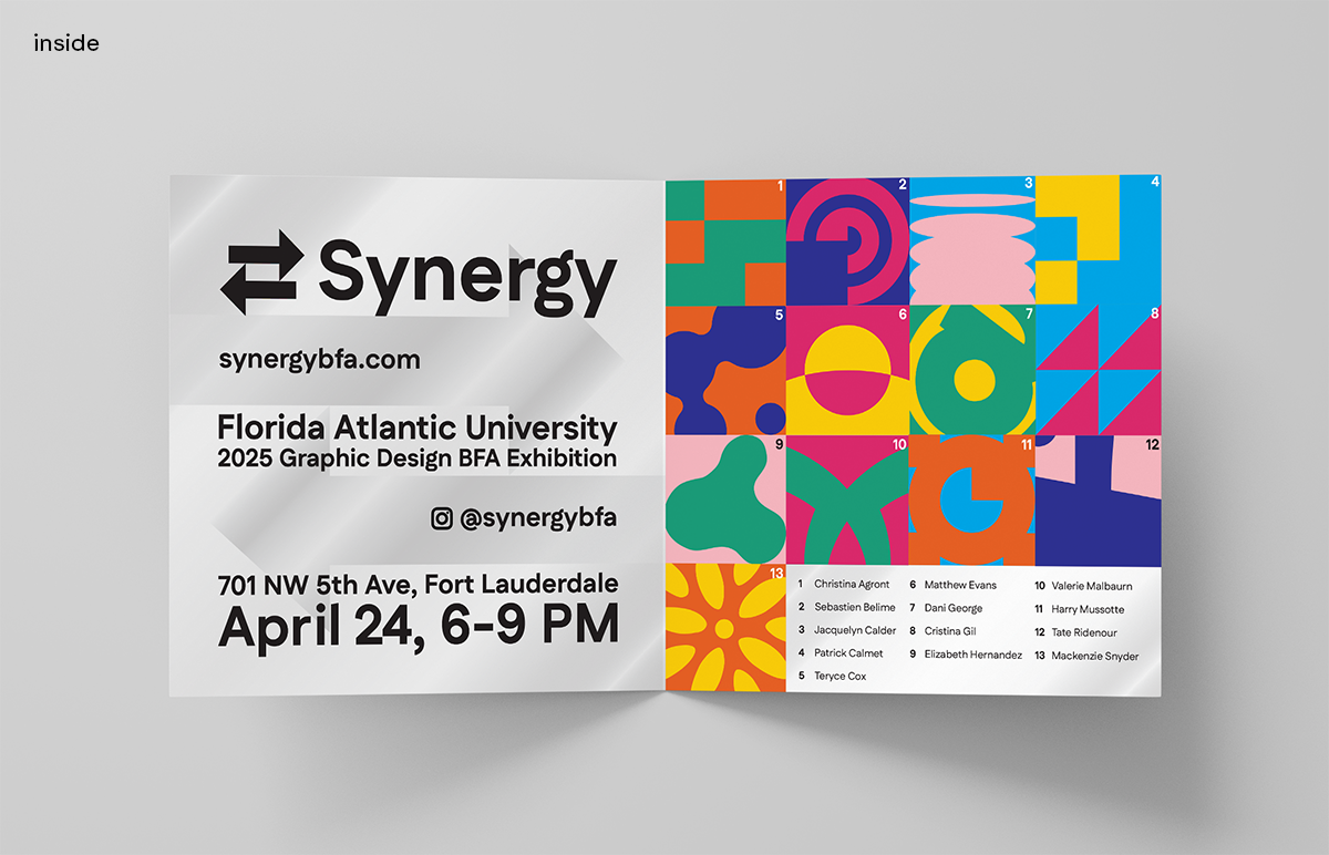
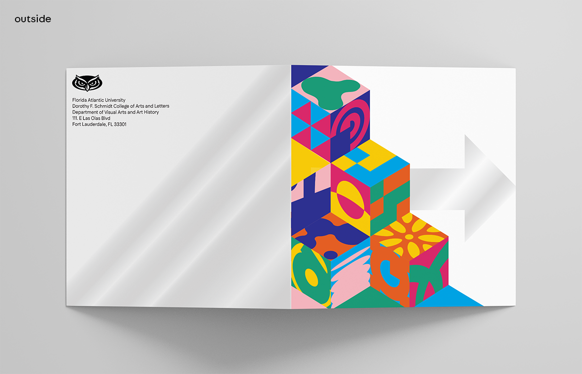
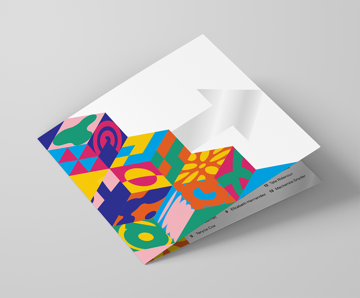
identity design
An invite for a graphic design exhibition of a class of newly graduating students. Each icon in the grid would be created by a student to represent the concept of “synergy”.
synergybfa.com